Plan UI
Unified the Plan UI with consistent navigation and self-service controls, reducing friction for teams managing their own billing.
Overview
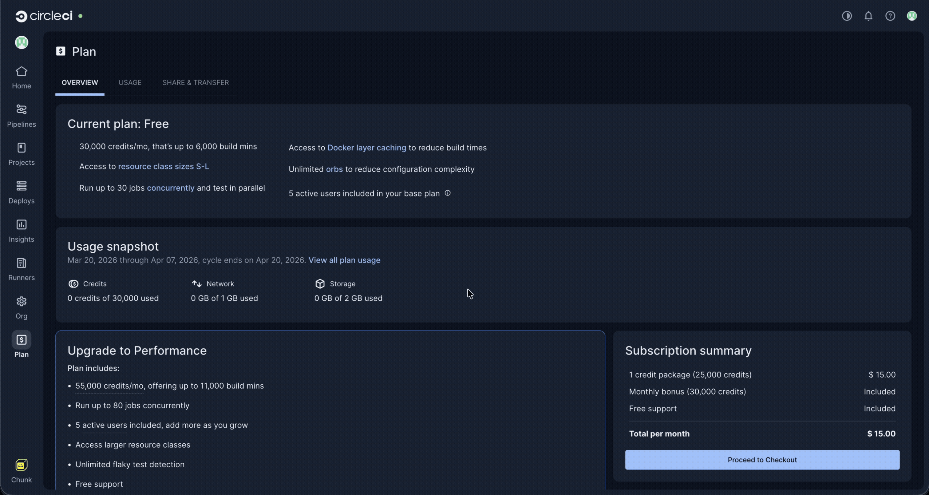
The Plan tab is a centralized hub for organizations to access information and manage their plans. However, being housed in a modal imposed technical and design limitations. This case study outlines the process of redesigning the Plan tab and its associated sub-pages to enhance consistency across CircleCI's web application, improve the user experience, and enable new features and experimentation.
Challenges
• Modal-based plan tab: The current Plan tab resides within a modal, presenting design and technical issues leading to inconsistencies.
• Cluttered overview page: Over time, the Overview page has become increasingly cluttered with content and features, making it difficult to navigate and to introduce new functionality.
• Flawed information architecture: The current information architecture does not align with users' core jobs-to-be-done (JTBD), making it harder for users to complete tasks and find information efficiently.
• Design system limitations: The absence of a standardized secondary navigation component in Compass (CircleCI's design system) complicates efforts to create a consistent user interface.


Objectives
• Establish consistency and cohesion: Create a uniform experience across different plan types and the inner application.
• Improve information architecture: Refine the existing IA to align with users' tasks and needs, making it easier for them to perform actions and find information.
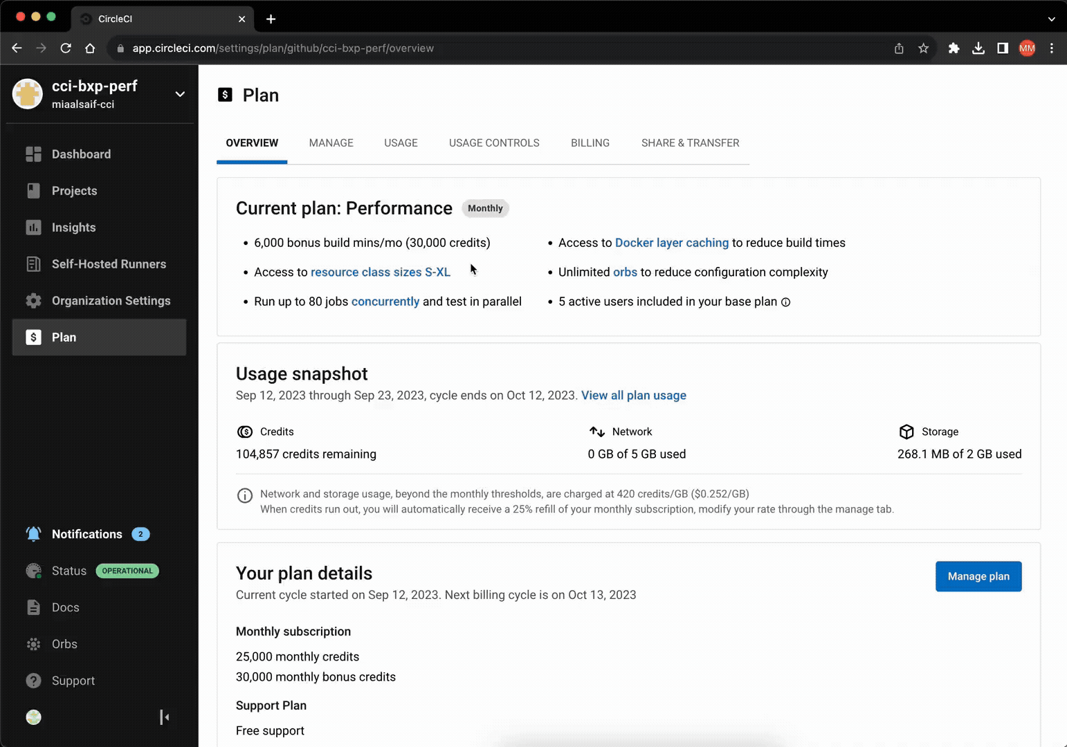
• Introduce performance plan management: Enable organizations to manage their plans directly, reducing reliance on account managers or sales.
• Enable upsells and new billing options: Facilitate upselling to Performance organizations and support the release of new billing options.
Success Metrics
The proposed changes are necessary investments. Success was measured through the following qualitative metrics:
• Reduce design and technical debt: Create consistency, eliminate limitations, and unlock new opportunities.
• Address customer issues: Resolve common requests and complaints, reducing support time for customer-facing teams.
• Enable new features: Support the release of features like prepaid billing.
Additionally, we monitored conversion rates, churn, and the number of support tickets related to the Plan UI.
The Process & Research
This was a design-led effort. Early in the process, I collaborated closely with product management and my design manager to establish a list of research activities aimed at meeting our objectives, coordinating them within a schedule to ensure timely delivery.

I began by defining and reviewing Jobs To Be Done (JTBD) with product management and a research colleague to define scope, assess user needs, and drive outcomes. We then concentrated on core jobs and mapped them using the framework's eight fundamental steps.


Next, I facilitated a card sorting workshop with product management, engineering, and fellow design team members. By synthesizing everyone's contributions, I structured the information architecture for each plan type's UI.


Ideating, Navigation
Leveraging the information gathered up to this point, I explored three navigation patterns. I discussed these with various teams, focusing especially on establishing a standard secondary navigation pattern for our design system. At the end of that feedback cycle, we collectively selected the most effective, reusable, and enduring option.


Ideating, Components
While working on this project, I was simultaneously improving the Free plan UI. To allocate resources effectively and ensure proper prioritization, we carefully orchestrated the release of both efforts. The iterative changes I made to the Free plan's overview GUI were performing well, so we carried them over into the new design. As for the Performance plan, I updated existing components and created new ones, ensuring they're functional and consistent with the Free plan. Finally, Custom and Scale plans were out of scope at the time; however, all changes took them into consideration.
Testing
After incorporating internal feedback, I created a prototype and conducted an unmoderated usability test. Participants were recruited from our current user base. The research goals were as follows:
• Gauge users' reactions to the redesign
• Validate the new secondary navigation and tabs
• Ensure core JTBD can be completed easily and intuitively


Usability Test Learnings and Updates
All participants completed every task successfully.
28s
Identify plan
1m 10s
Upgrade
40s
Find highest spend project
42s
Usage controls
32s
Cancel plan
Based on insights from the usability testing data and feedback, I made the following changes:
• Updated the information architecture for easier navigation and better content organization.
• Introduced “Manage” and “Usage Controls” tabs to the Performance plan for improved functionality.
• Revised copy for clarity and easier findability.
• Standardized notifications to provide consistent user feedback in response to actions.


Impact
• Consistency and Cohesion: Established uniformity across plan tiers and the entire application.
• Findability and Functionality: Core jobs to be done are easily accomplished, allowing organizations to view and manage their plans.
• Unlocked Opportunities: Released prepaid billing, enabling over 68 organizations to bulk-buy credits and generate significant revenue quickly.
• Reduced Support Tickets: Addressed common customer complaints, decreasing user frustration and reducing incoming support tickets.
While the design system around it has since been updated, the core solution remains live on CircleCI today, speaking to its longevity.
Let's work together
Available for new opportunities. If you need a designer who moves fast and owns the work end-to-end, I'd like to hear what you're working on.